
Babyplots is an easy to use library for creating interactive 3d graphs for exploring and presenting data.
The minified JavaScript library can be downloaded here.
You can find the source code repository of the library here.
To use babyplots on your website, include the file in your header:
<script src="babyplots.js"></script>To display a babyplots visualization, you need a canvas element with an id somewhere in the body of your html file.
<canvas id="babyplot"></canvas>It is possible to have multiple babyplots visualizations on your page as long as each canvas has a unique id. However, most browsers have a limit of how many WebGL contexts can be active at the same time.
The next step is to create the Plots object. This object stores the
settings for how to display the
babyplots visualization, methods to interact with it, as well as the data itself. You can create this object within
a script tag, or in a separate JavaScript file. Just make sure to load the babyplots library before.
var vis = new Baby.Plots("babyplot", {backgroundColor: "#ffffffff"});The first argument in the constructor is the id of the canvas that we created in the previous step. The second argument is a JavaScript object containing options to customize the visualization, e.g. the background color of the canvas. Check out the section on the Plots object below, to find out about the possible options.
After having created the object, you can add a visualization to it. You can do that from data variables defined in
JavaScript using the addPlot(), addImgStack() or addMeshObject() methods.
More on that in the
section on plot types.
Alternatively, you can load all plot data from a JSON file that was created either manually, or using the export function of one of the babyplots implementations (JavaScript, R, Python, or the NPC).
vis.fromJSON(myPlotData);To actually show the visualization in the canvas element, use the doRender() method.
vis.doRender();This covered the basics of how to display a babyplots visualization in a html page. The next sections include more information on the Plots object, its properties and methods, and the different types of visualizations. To summarize, the following shows a minimal html page that creates a babyplots visualization.
<!DOCTYPE html>
<html>
<head>
  <script src="babyplots.js"></script>
</head>
<body>
  <canvas id="babyplot"></canvas>
  <script>
    var vis = Baby.Plots("babyplot", {backgroundColor:"#ffffffff"});
    vis.fromJSON(myPlotData);
    vis.doRender();
  </script>
</body>
</html>
The Plots Object is the central part of the babyplots visualization
library. It can be created using its constructor function, which takes two arguments:
The following options allow you to customize the visualization.
| Option | Type | Description |
|---|---|---|
| backgroundColor | string | Color in hex format for the background of the canvas (eg. "#ffffffff"). |
| turntable | boolean | Setting turntable to true spins the camera around the plot with a constant speed. |
| rotationRate | number | The speed at which the camera spins around the camera rotates around the plot if turntable is set to true. A positive value rotates the camera counter clockwise, a negative value clockwise. |
| xScale, yScale and zScale | number | Apply a scaling factor to an axis, stretching or squishing the plot. |
| shapeLegendTitle | string | Title of the legend showing the names and plot types of multiple plots, if at least one plot has legendShowShape enabled. |
| upAxis | string | Sets the camera up vector; Either "+x", "-x", "+y", "-y", "+z", or "-z" (Default: "+y"). |
| workerPath | string | Path to the directory containing the worker script for gif recording with CCapture. |
The properties turntable and rotationRate can also be changed after creating the Plots object.
var vis = new Baby.Plots("babyplot");
vis.turntable = true;
vis.rotationRate = -0.01;
The Plots object exposes a few methods that allow you to add a
visualization, to interact with it programmatically, or to control its behavior.
addPlot(coordinates, plotType, colorBy, colorVar, options)
The addPlot() method creates a plot and adds it to the Plots object to visualize it in a
canvas. The plot types section below enumerates the different kinds of visualizations that
can be created using this method. The addPlot() method takes the following arguments:
| Argument | Type | Description |
|---|---|---|
| coordinates | number[][] | An array of arrays with coordinates of data points. |
| plotType | string | The name of one of the plot types. Either "pointCloud", "shapeCloud", "heatMap", or "surface". |
| colorBy | string | How to interpret the colorVar parameter, either "direct", "categories", or "values". If colorVar is an array of hex strings, colorBy should be "direct". If colorVar is an array of discrete values (e.g. category names), colorBy should be "categories". If colorVar is an array of continuous values, colorBy should be "values". |
| colorVar | number[] or string[] | An array of hex strings, category names, or values, corresponding to the data points in the coordinates parameter. |
| options | Object | An object with general and plot type specific options. |
The following options apply to all plot types:
| Option | Type | Description |
|---|---|---|
| name | string | Name of the plot. Displayed in the shape legend if legendShowShape is set to true. |
| colorScale | string | Sets the color scale for the plot. The name of any colorbrewer color scale or "Viridis". |
| customColorScale | string[] | If colorScale is set to "custom", a custom color scale can be created using an array of colors in hex format. The colors are interpolated if colorBy is set to "values" or if there are not enough colors for all categories in customColorScale. |
| colorScaleInverted | boolean | Inverts the color scale if set to true. |
| sortedCategories | string[] | By default, categories are sorted alphabetically. If this is not wanted, you can supply an array of category names in the order in which you would like them to be sorted in the legend and the color scale. |
| showLegend | boolean | Display the color scale legend? |
| legendShowShape | boolean | If set to true, the plot is shown in a separate shape legend with its symbol and name. |
| fontSize | number | Font size for the legend. |
| fontColor | string | Color for the legend text in hex format. |
| legendTitle | string | Title for the legend. |
| legendTitleFontSize | number | Font size for the legend title. |
| legendTitleFontColor | string | Color for the legend title. |
| legendPosition | string | Controls the position of the legend. Either "left", or "right". If not specified, the legend of the first plot will be positioned on the right, the second on the left. More than 2 legends are not supported. |
| showAxes | boolean[] | Display plot axes? showAxes takes an array of length three, one boolean for each of the three axes (x, y, and z). |
| axisLabels | string[] | Array of length three for the labels of the three axes. E.g. ["X", "Y", "Z"]. |
| axisColors | string[] | Array of length three for the colors of the three axes in hex format. |
| tickBreaks | number[] | Array of length three for the interval between ticks of the three axes. |
| showTickLines | boolean[][] | Display lines across the axes? Array of length three with arrays of length two for all combinations ([[xy, xz], [yx, yz], [zx, zy]]). |
| tickLineColors | string[][] | Colors for the tick lines in hex format. Same order as in showTickLines. |
addPlot() can be called multiple times on the same Plots object to combine visualizations.
Additionally, it can also be combined with addImgStack() and fromJSON() method calls.
addImgStack(values, indices, attributes, options)
The addImgStack() method creates a 3-dimensional visualization of an RGB image stack, as generated from
e.g. a fluorescent microscope, and adds it to the Plots object to visualize it in a canvas. The data
must be in a special format for this function which is optimized for size. The easiest way to create this
visualization is using the R implementation of babyplots, which includes a function to directly read
.tif files. The addImgStack() method takes the following arguments:
| Argument | Type | Description |
|---|---|---|
| values | number[] | An array of intensity values. Currently only 8-bit images are supported (0-255). |
| indices | number[] | Indices of the values in the original image. |
| attributes | Object | Image attributes. Only a "dim" attribute is needed containing the dimensions (x, y, c, z) of the image. |
| options | Object | An object with options to customize the visualization. |
The following options can be set:
| Option | Type | Description |
|---|---|---|
| size | number | The size of the 3d pixels |
| intensityMode | string | Controls how the pixel intensity is visualized. The default "alpha" gives an opacity to the 3d pixels based on the intensity value. "mix" mixes the pixel color with the background color of the canvas. "none" displays all 3d pixels at full brightness, regardless of the intensity value. |
| showAxes | boolean[] | Display plot axes? showAxes takes an array of length three, one boolean for each of the three axes (x, y, and z). |
| axisLabels | string[] | Array of length three for the labels of the three axes. E.g. ["X", "Y", "Z"]. |
| axisColors | string[] | Array of length three for the colors of the three axes in hex format. |
| tickBreaks | number[] | Array of length three for the interval between ticks of the three axes. |
| showTickLines | boolean[][] | Display lines across the axes? Array of length three with arrays of length two for all combinations ([[xy, xz], [yx, yz], [zx, zy]]). |
| tickLineColors | string[][] | Colors for the tick lines in hex format. Same order as in showTickLines. |
addImgStack() can be called multiple times on the same Plots object to combine
visualizations. Additionally, it can also be combined with addPlot() and fromJSON() method
calls.
addMeshObject(rootUrl, filePrefix, fileSuffix, fileIteratorStart, fileIteratorEnd, frameDelay, options)
The addMeshObject() method loads a 3D model or a scene of 3D models from a glTF string, and adds it to
the Plots object to visualize it in a canvas.The addMeshObject() method takes the
following arguments:
| Argument | Type | Description |
|---|---|---|
| meshString | string | The glTF string. |
| options | Object | An object with options to customize the visualization. |
The following options can be set:
| Option | Type | Description |
|---|---|---|
| meshScaling | number[] | Array of length three to apply a scaling to the object(s) along the x, y and z axes. |
| meshRotation | number[] | Array of length three to apply a rotation to the object(s) along the x, y and z axes. |
| meshOffset | number[] | Array of length three to offset the position of the object(s) along the x, y and z axes. |
| showAxes | boolean[] | Display plot axes? showAxes takes an array of length three, one boolean for each of the three axes (x, y, and z). |
| axisLabels | string[] | Array of length three for the labels of the three axes. E.g. ["X", "Y", "Z"]. |
| axisColors | string[] | Array of length three for the colors of the three axes in hex format. |
| tickBreaks | number[] | Array of length three for the interval between ticks of the three axes. |
| showTickLines | boolean[][] | Display lines across the axes? Array of length three with arrays of length two for all combinations ([[xy, xz], [yx, yz], [zx, zy]]). |
| tickLineColors | string[][] | Colors for the tick lines in hex format. Same order as in showTickLines. |
addImgStack() can be called multiple times on the same Plots object to combine
visualizations. Additionally, it can also be combined with addPlot() and fromJSON() method
calls.
fromJSON(data)
Load a visualization from a saved JSON object. The R, JavaScript and Python implementations of babyplots as well as
the NPC allow the export of visualizations as JSON files. Loading of a saved
visualization using fromJSON() overwrites previously set properties of the Plots object.
Multiple visualizations can be loaded through subsequent calls to fromJSON(). Additionally,
fromJSON() can be combined with the addPlot() and addImgStack() methods.
doRender()
To display the visualization on the canvas, this method needs to be called after creating of the
Plots object and adding plots.
createButtons(whichBtns)
Shows UI buttons on the top left of the plot that give additional control. Takes as an argument an array with names
of buttons to create any combination of "labels" (opens UI to add, edit and remove labels), "json" (exports the
visualization as a JSON file), "turntable" (toggles rotation of camera around the visualization), "publish" (opens
UI to publish the visualization to the babyplots web service), and "record" (records an
animation of the visualization as a gif using CCapture, requires
the CCapture
library to be
loaded and the CCapture
worker script to be located in the same directory as the babyplots library, or at the directory specified with
the workerPath option).
vis.createButtons(["turntable", "json", "label", "record", "publish"]);thumbnail(size, saveCallback)Saves a screenshot of the visualization. The size parameter is a number defining the width and height of the screenshot in pixels. The saveCallback argument is a function that takes as its argument the screenshot as a base64-encoded string.
addLabels(labelList)
Creates text labels that can be placed in the 3-dimensional visualization space. The easiest way to create these
labels is using the UI, that can be shown with createButtons(["labels"]). Alternatively,
addLabels() can be used to create labels programmatically. The argument is an array of arrays. The
inner
arrays are of length four and define the position, as well as the text of the labels [x, y, z, text].
resize()
Resizes the visualization to the current size of the canvas. This method should be bound to a resize event of the
canvas (see the example below). It is also recommended to call the resize() method once after the
doRender() call.
window.onresize = function () {
  vis.resize();
}
dispose()
Releases all held resources of the Plots visualization. Useful to clear memory, after a visualization
is no longer needed.
The following four plot types are available from the addPlot() method through the plotType
parameter.
"pointCloud"Creates a cloud of data points defined by their x, y and z coordinates (in an array of arrays, [[x1, y1, z1], [x2, x2, x2], ..., [xn, yn, zn]]), as well as another variable that controls the color of each data point (in an array in the same order as the coordinates, [c1, c2, ..., cn]). This can be a color value in hex format, a numerical value, or a category name.
Each data point in the point cloud can also have a second set of coordinates and an animation can be played transitioning between the two sets of coordinates.
The following plot type specific options are available in addition to the general options outlined in the
addPlot() section.
| Option | Type | Description |
|---|---|---|
| size | number | Controls the size of the points. |
| hasAnimation | boolean | Include an animation between two sets of coordinates for each point. (Replaced "folded" option) |
| animationTargets | number[][] | The second set of coordinates for each point in the same format and order as in the coordinates parameter. (Replaced "foldedEmbedding" option) |
| animationDelay | number | Time in frames after which the animation should be played. (Replaced "foldAnimDelay" option) |
| animationDuration | number | The duration of the animation in frames. (Replaced "foldAnimDuration" option) |
| animationLoop | boolean | Loop the animation (forwards and reverse). |
| addClusterLabels | boolean | In plots colored by categories, add 3D labels at the centroids of the points belonging to each category. Placement and label text can be customized using the label manager. |
"shapeCloud"Creates a cloud of data points represented as predefined 3-dimensional shapes defined by their x, y and z coordinates (in an array of arrays, [[x1, y1, z1], [x2, x2, x2], ..., [xn, yn, zn]]), as well as another variable that controls the color of each data point (in an array in the same order as the coordinates, [c1, c2, ..., cn]). This can be a color value in hex format, a numerical value, or a category name.
Available shapes are:
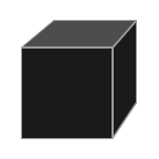
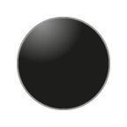
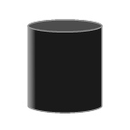
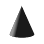
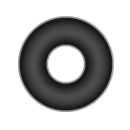
All data points of one shapeCloud plot have the same shape. You can combine multiple shape plots with different
shapes. If legendShowShape is set to true, the plot will be listed in a separate legend, with its name
and shape.
Additionally, each data point can have an information string assigned to it that is displayed when the corresponding shape in the plot is clicked. These strings can include line breaks ("\n").
The following plot type specific options are available in addition to the general options outlined in the
addPlot() section.
| Option | Type | Description |
|---|---|---|
| shape | string | Defines the shape of the data points. Available shapes are: "box", "sphere", "cylinder", "cone", and "torus". |
| size | number | Controls the size of the shapes. |
| dpInfo | string[] | Array of strings of same length as there are data points in the plot. |
"surface"Creates a surface from height data. The coordinates argument takes the height y in a matrix (column x row): [[y1,1, y2,1, ..., yn,1], [y1,2, y2,2, ..., yn,2], ..., [y1,n, y2,n, ..., yn,n]]. Each data point in the surface also has a color variable: [c1,1, c2,1, ..., cn,1, c1,2, ..., cn,n]. This can be a color value in hex format, or a numerical value. The color of the area between the points is interpolated.
The surface plot has no additional options besides the general options outlined in the addPlot()
section.
"heatMap"Creates a 3-dimensional bar plot where each data point of a matrix (column x row) is represented by a pillar of height y: [[y1,1, y2,1, ..., yn,1], [y1,2, y2,2, ..., yn,2], ..., [y1,n, y2,n, ..., yn,n]]. Each data point also has a color variable: [c1,1, c2,1, ..., cn,1, c1,2, ..., cn,n]. This can be a color value in hex format, a numerical value, or a category name.
The following plot type specific options are available in addition to the general options outlined in the
addPlot() section.
| Option | Type | Description |
|---|---|---|
| size | number | Controls the width in the x and z dimensions of the pillars. Values should be between 0 and 1, values over 1 cause the pillars to intersect each other. |
| colnames | string[] | Names of columns to be displayed on the x and z axes. |
| rownames | string[] | Names of rows to be displayed on the x and z axes. |
"line"Creates a continuous line described by points defined by their x, y and z coordinates (in an array of arrays, [[x1, y1, z1], [x2, x2, x2], ..., [xn, yn, zn]]), as well as another variable that controls the color of each point (in an array in the same order as the coordinates, [c1, c2, ..., cn]). This can be a color value in hex format, a numerical value, or a category name. The colors of two subsequent points are interpolated along the line between the two points.
Each point along the line can also have a text label that is drawn next to the points and can be controlled in their size and color.
The following plot type specific options are available in addition to the general options outlined in the
addPlot() section.
| Option | Type | Description |
|---|---|---|
| labels | string[] | Labels for the points along the line. An array of the same length as numbers of points on the line. |
| labelSize | number | Size of the labels (default: 100) |
| labelColor | string | The color of the labels. Either a color hex string, or "match". If set to "match", the labels are colored according to the corresponding point color (defined in colorVar). |
| hasAnimation | boolean | Include an animation connecting the points of the line one by one. |
| animationDelay | number | Time in frames after which the animation should be played. |
| animationDuration | number | The duration of the animation in frames. |
An animation of a babyplots visualization can be as a gif using CCapture. This requires
the CCapture
library to be loaded and the CCapture
worker script to be located in the same directory as the babyplots library, or at the directory specified with
the workerPath option.
The recorded animation is a 360° rotation of the camera around the visualization. If the visualization contains other animations, such as "animationTargets" in PointClouds or an animated line plot, the recording duration and speed is adjusted so that the entire animation fits within the 360° rotation.
To record, you need to add the "record" button to the visualization.
<!DOCTYPE html>
<html>
<head>
  <script src="babyplots.js"></script>
  <script src="CCapture.all.min.js"></script>
</head>
<body>
  <canvas id="babyplot"></canvas>
  <script>
    var vis = Baby.Plots("babyplot", {backgroundColor:"#ffffffff"});
    vis.fromJSON(myPlotData);
    vis.createButtons(["record"]);
    vis.doRender();
  </script>
</body>
</html>